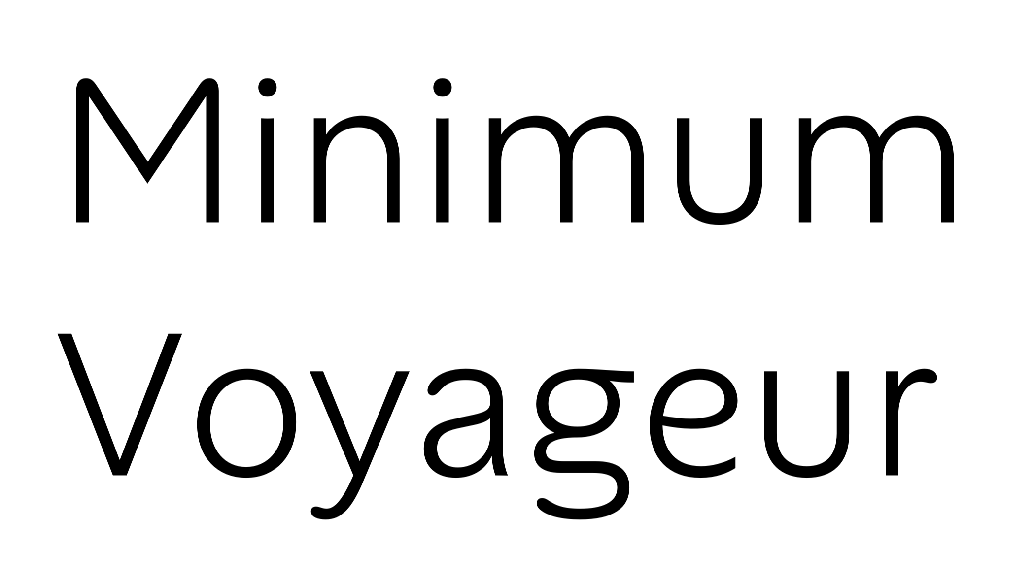
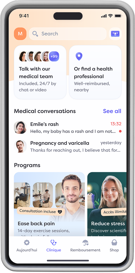
Alan’s voice was always special, so we gave it a unique shape. Here’s how.
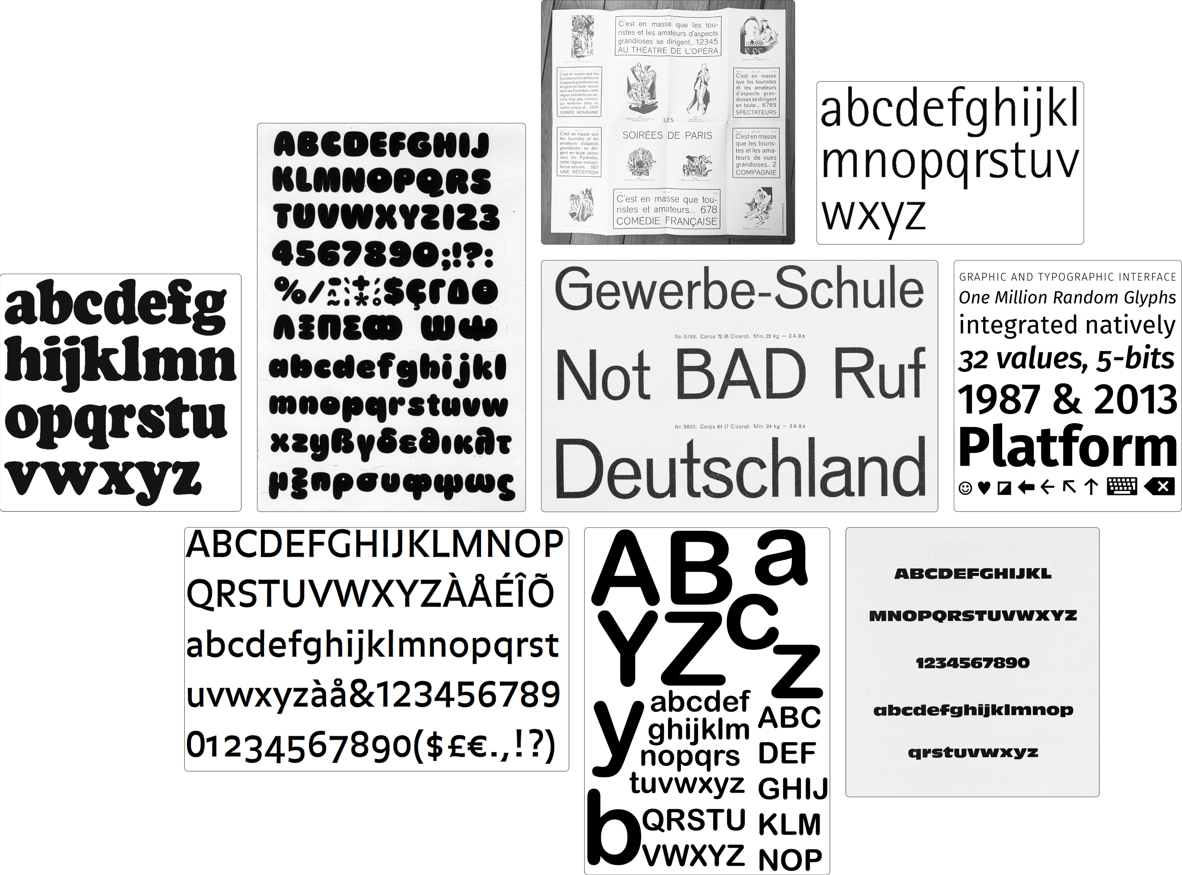
Did you know the first custom typeface was French?
In 1694, Louis XIV (of course it was him) commissioned the "Romain du Roi" as part of his agenda to establish France's dominance in arts and science. It took about 20 years to complete, and quickly became a staple of the King's visual language — so much so that using it without His Majesty's approval was punishable by death.
Centuries later, many organizations have followed the Sun King's footsteps. IBM, Airbnb, or Apple have all created their own proprietary typeface. And when you consider that the modern adult now spends about a third of their waking time reading in some way, the investment still feels worth it.
Today, Alan joins the club. And the good news is: anyone can use it, no execution involved.
Why design a custom typeface?
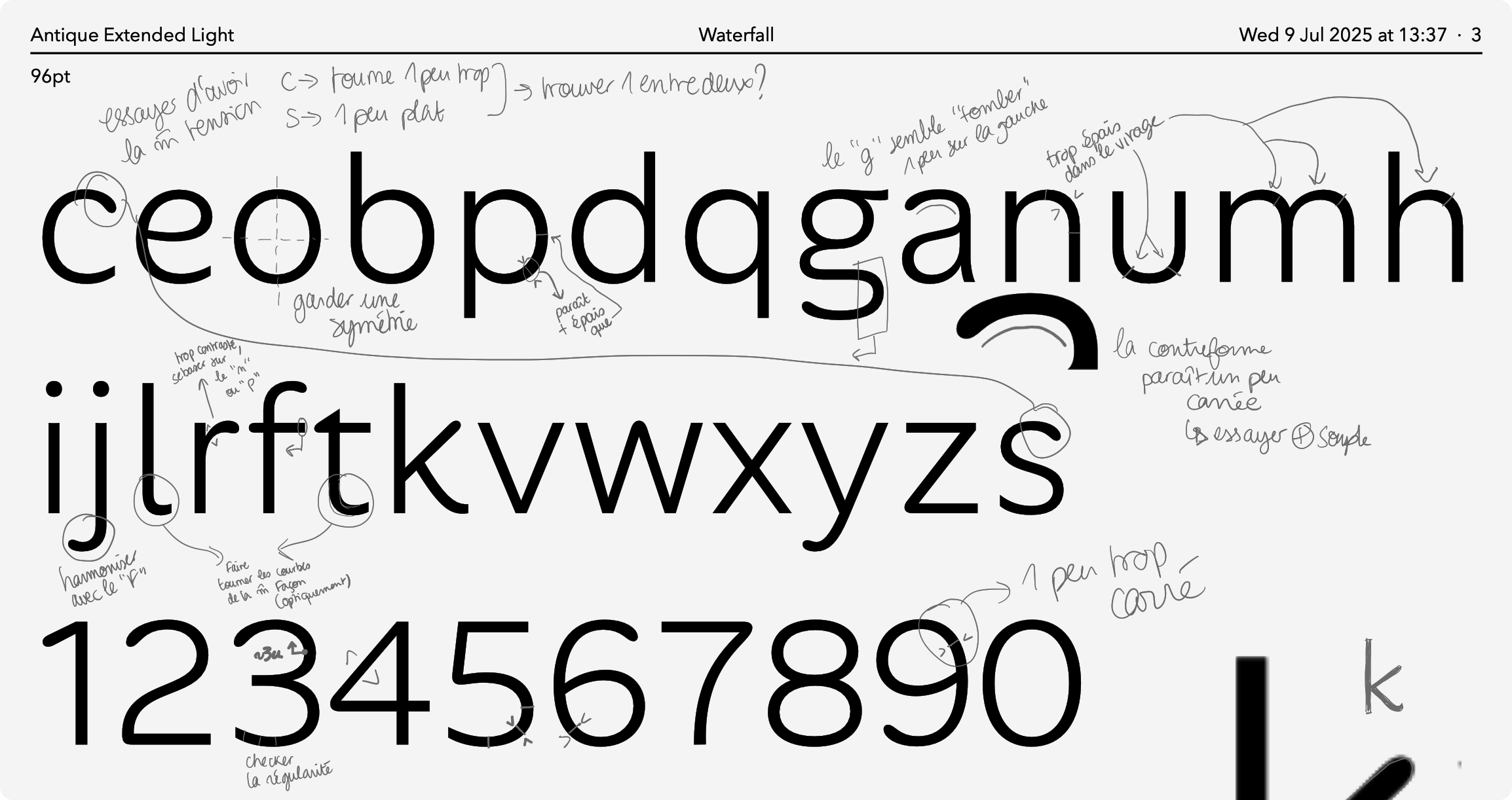
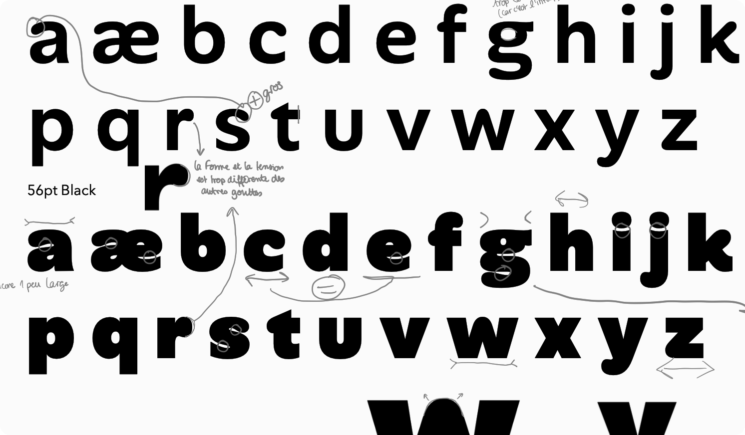
Thankfully, it no longer takes 20 years to design a good typeface, but the process remains long and demanding. Depending on the number of styles and glyphs you want, you could be looking at years of effort. So you really need a good reason to take the plunge.
Most of the time, there are two good reasons.
Form
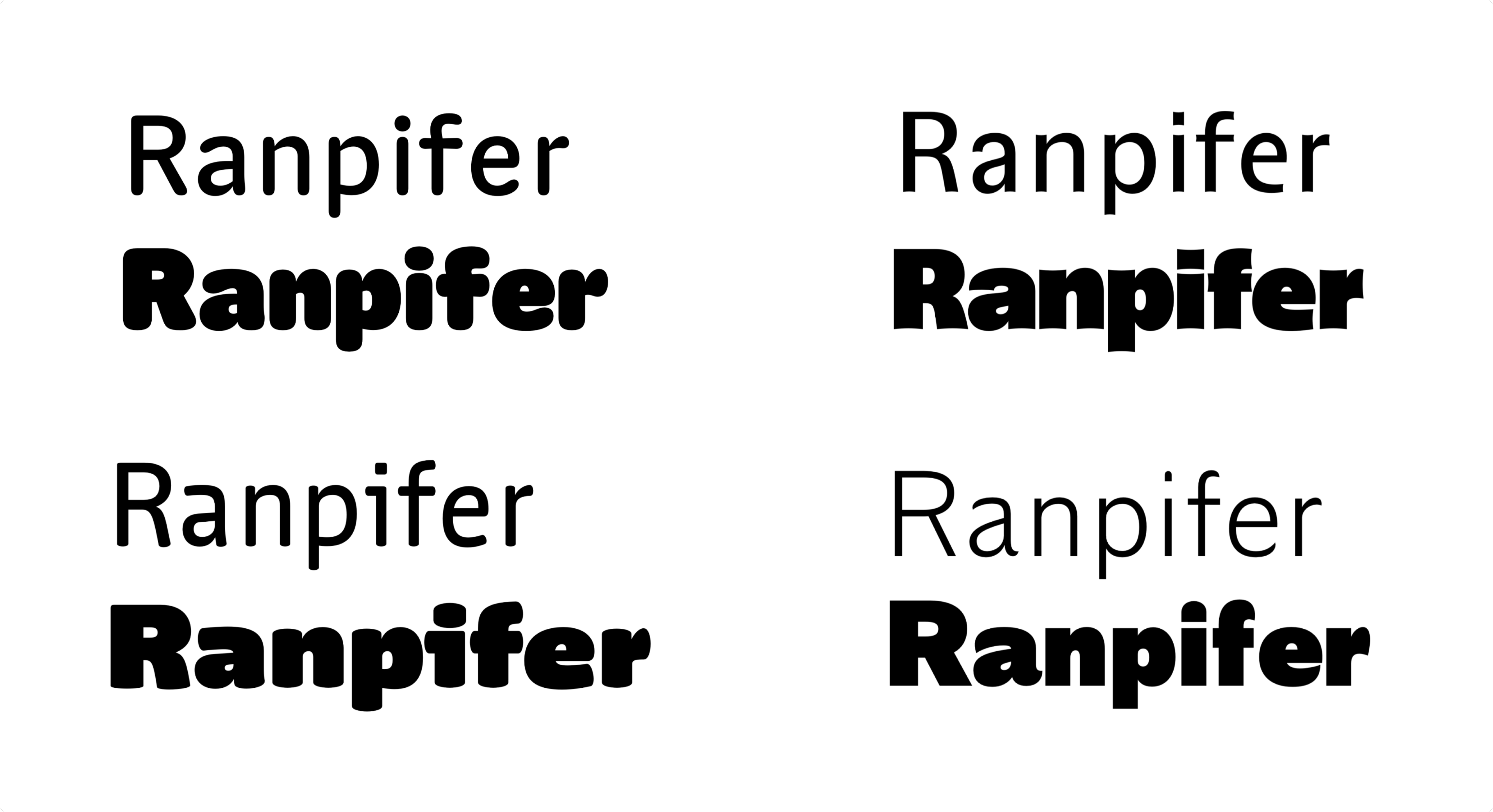
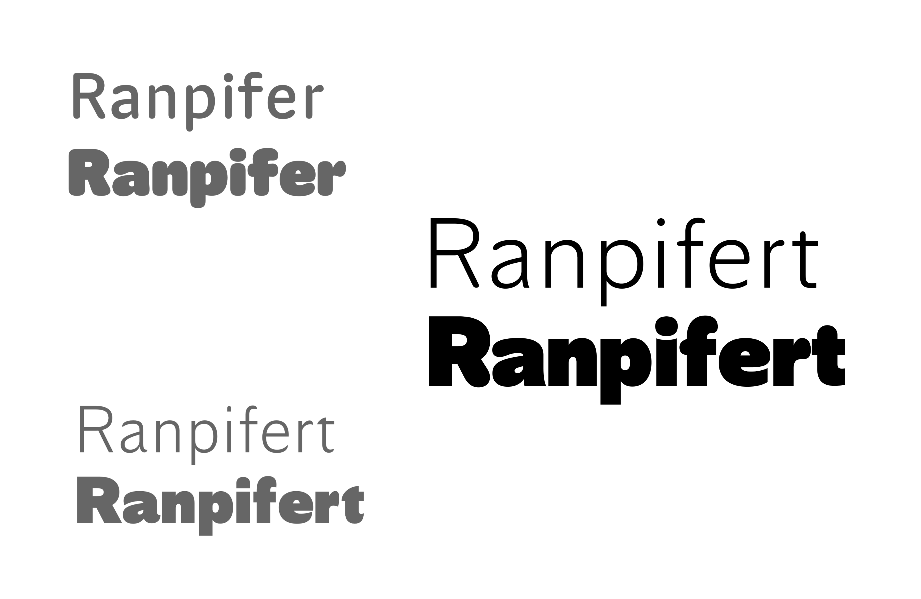
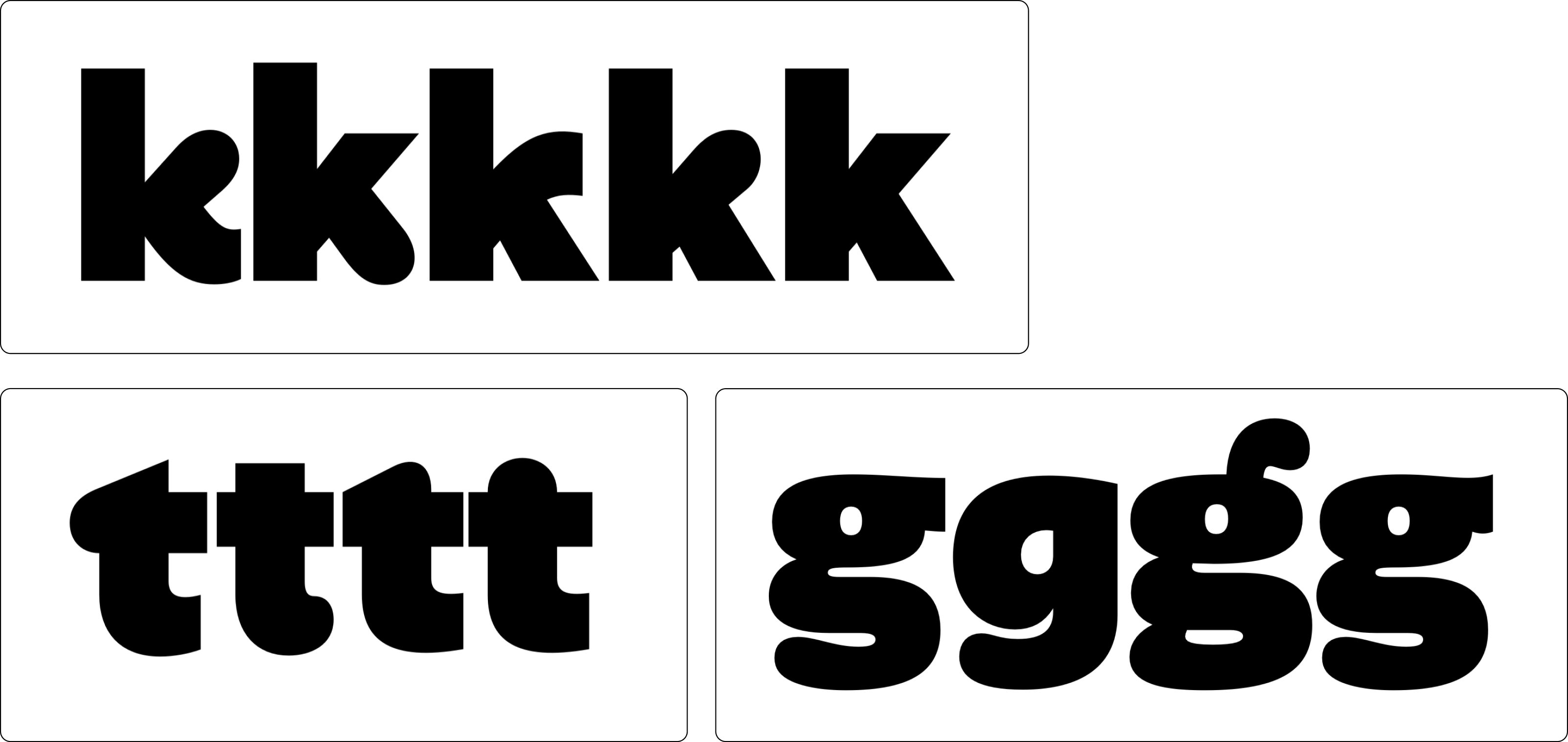
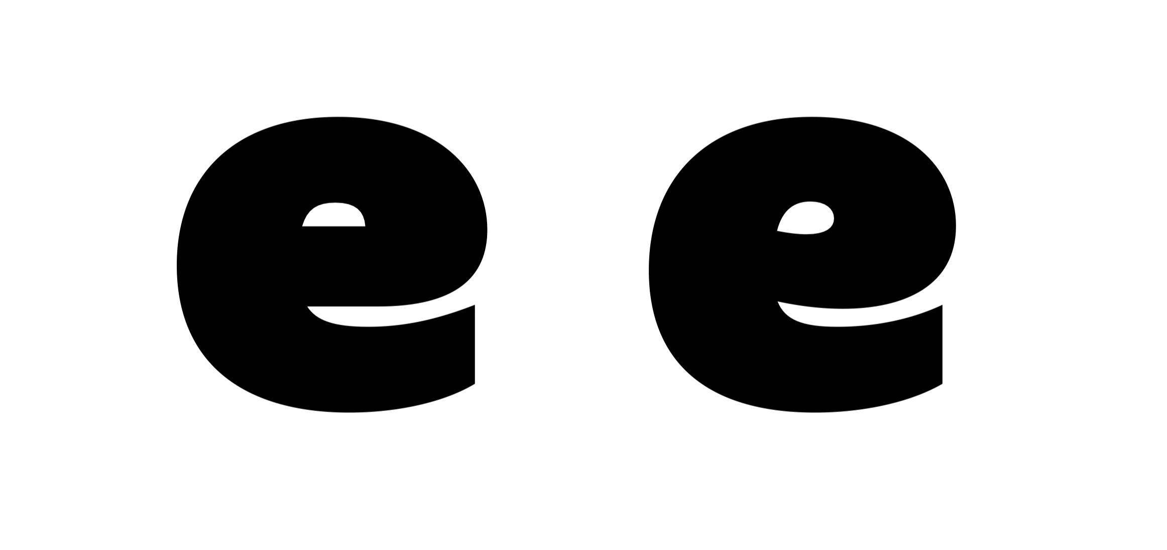
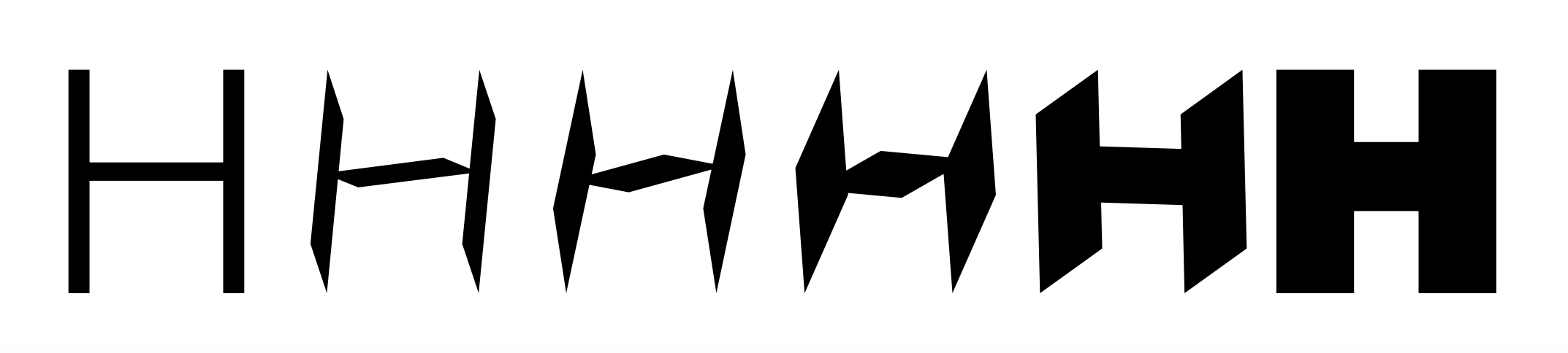
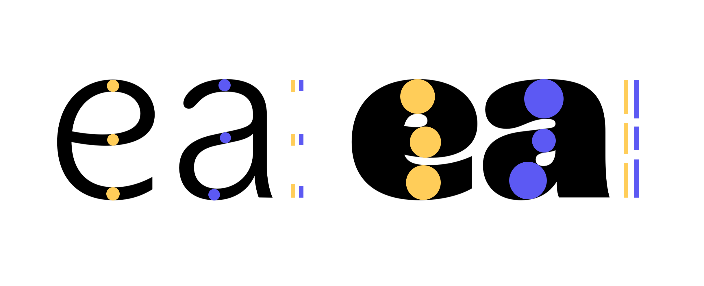
The first one is of course linked to aesthetic considerations. Can your company’s voice have its unique visual texture? Can the shape of your text carry a deeper meaning and reflect your values? Could you be recognizable only with text? The short answer is yes, with a custom typeface, and enough time to make it stick.
Function
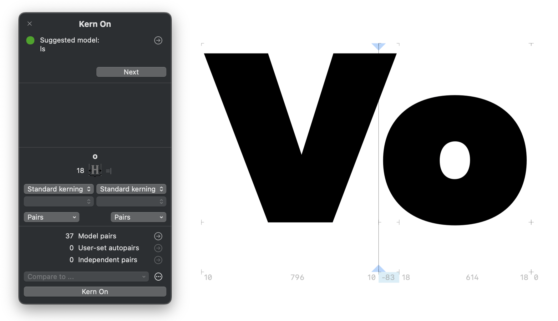
The second reason is more linked to the performance of the typeface as an information carrier. You could be limited by its language covering for example, or by its lack of compatibility with some devices. Readability, accessibility or even technical performance also play a big role (think transportation infrastructures).
In the case of Alan, we had frustrations on both fronts.
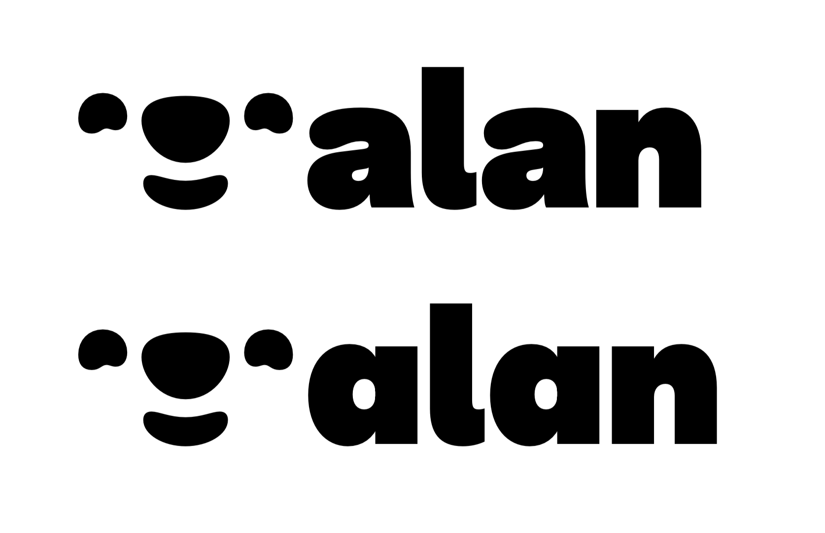
In terms of aesthetics, while our previous typeface Filson was perfectly fine, it felt like wearing the same outfit to every occasion. We needed something more playful for marketing purposes, but also capable of showing restraint for product or corporate uses. Filson was in between. Kinda fun, kinda transparent, but not decisively either.
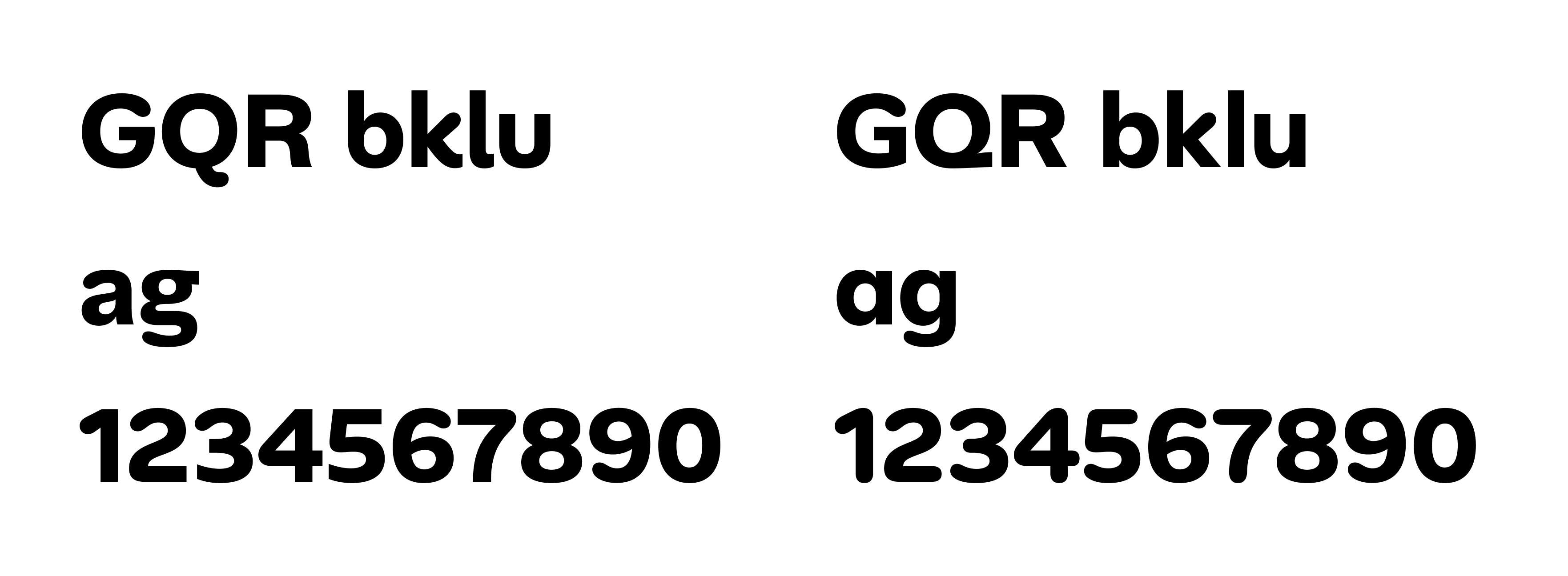
On the technical aspect, our biggest issue was tool compatibility. We spent months perfecting our brand identity. Colors, logos, photography style — everything was dialed in. Then we opened Google Slides or Gmail to find ourselves forced to compromise on Montserrat (a fine typeface, just not the right one). That was frustrating. Filson couldn't live where we worked most.